Augmented Reality: How It Works & Its Impact in 2025
In today’s modern world having a cell phone is a must. You carry your device with you everywhere you go so you can check your texts, social media, and take pictures.

#DrivingExpertLedTransformation
Visualizations are pictures that make it easier for the viewer to understand data than a bunch of numbers in rows and columns. Visualized data inspires immediate questions about a company’s sales, growth, and who uses its services, bringing a web page to life as simple charts could never do.
Microsoft PowerBI is a leader in data visualization and it shouldn’t be surprising that the package includes a wide variety of tools and customizations to support almost every need, but before we look into the specifics, let’s start with some key reasons why you need to visualize your data.
Data visualization is about more than making numbers look nice. The goal is to generate insights quickly, easily, and without the need for a personal data scientist looking over your shoulder. It’s also about sharing your data, enabling a broad cross-section of teams in your organization to benefit from your analytics initiatives without having to deep dive into the underlying numbers. Here are a few key advantages to visualizing data:
1) Absorption: Your data set might contain millions or even billions (perhaps trillions) of individual points, making sense of it can be a daunting prospect, and visualization helps pictorialize everything into a single, meaningful view.
2) Insights: Visualization allows you to see the trends unfolding, identify outliers, and connect what might appear to be disparate data into new insights, enabling a new level of understanding.
3) Action: Pictorialized representations encourage more immediate action with more support from your colleagues than raw numbers; if you see it, you can remember it, and ensure that the complexity of the numbers doesn’t interfere with your ability to chart a course forward for your organization.
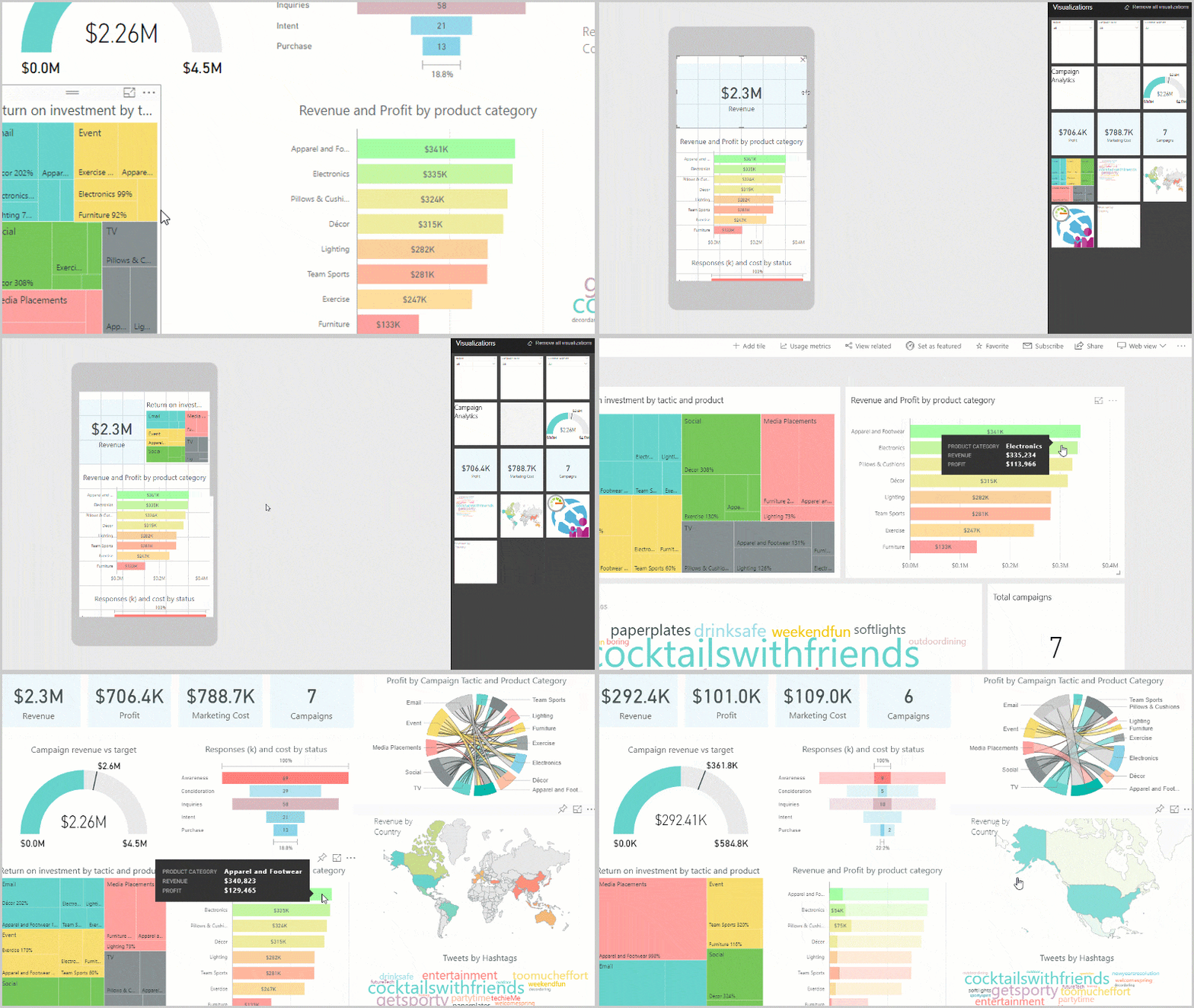
Microsoft’s Power BI offers a wide variety of visualizations and features right out of the box including the ability to customize and combine multiple data sets. Power BI reports can also provide a multi-perspective view of a dataset, with either a single Power BI data visualization or pages full of visualizations that represent different findings and insights. To protect your data, there are administrative controls that allow report creators to edit the visuals and its underlying dataset, while consumers can view the report but not make changes.
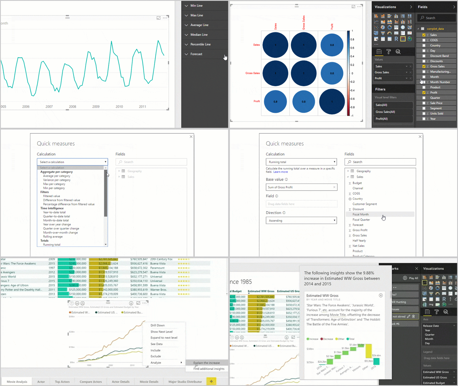
You can begin to visualize your data using a large number of different visual types available directly from the Power BI “Visualizations” pane.

There are even ways to integrate geographical data directly with Bing. Given all of the options, a good way to get started is to focus on your requirements first. A meaningful report requires a little planning and understanding of what insights you are looking to gain. Make sure your report is going to tell a story, and then experiment with the Power BI data visualizations that fit best.
Of course, Power BI data visualization also supports custom visuals – created by developers to enable business users to see their data in a way that fits the business best. This is getting a little complicated for non-technical users, but is important if you have a specific need. In short, Power BI data visualization allows users to connect to various data sources, transform and model power bi report the data, and create interactive visualizations and reports.
Also, note that more creative types can dig into Microsoft’s developer tools and learn how to create and add your visuals to this community site. Either way, you can experiment with different types of visualizations to see what works best with your data. By integrating Power BI with Dynamics 365, businesses can combine data from multiple sources, including Dynamics 365 and other business applications, into a single analytics platform. Moreover, Power BI Dynamics 365 databases or data sources enable real-time data to be pulled into Power BI for analysis and visualization.
Data visualization tools must be flexible to meet your company’s specific needs and tell its unique story. At Korcomptenz, we can help you understand what visualizations might work best for you and make analyzing data become a faster, easier, and more insightful process. Whether you want to use bar and column, doughnut, funnel, or gauge charts; basic or ArcGIS maps; tables, or standalone images, we are here to guide you and keep your company at the forefront of technology.


In today’s modern world having a cell phone is a must. You carry your device with you everywhere you go so you can check your texts, social media, and take pictures.

Harness the power of Retail Analytics for a business supercharge. Unlock insights to propel growth and enhance decision-making.

Unlock actionable insights and optimize your inventory management with data-driven analytics, empowering informed decision-making and improved visibility.
| Cookie | Duration | Description |
|---|---|---|
| cookielawinfo-checkbox-analytics | 11 months | This cookie is set by GDPR Cookie Consent plugin. The cookie is used to store the user consent for the cookies in the category "Analytics". |
| cookielawinfo-checkbox-functional | 11 months | The cookie is set by GDPR cookie consent to record the user consent for the cookies in the category "Functional". |
| cookielawinfo-checkbox-necessary | 11 months | This cookie is set by GDPR Cookie Consent plugin. The cookies is used to store the user consent for the cookies in the category "Necessary". |
| cookielawinfo-checkbox-others | 11 months | This cookie is set by GDPR Cookie Consent plugin. The cookie is used to store the user consent for the cookies in the category "Other. |
| cookielawinfo-checkbox-performance | 11 months | This cookie is set by GDPR Cookie Consent plugin. The cookie is used to store the user consent for the cookies in the category "Performance". |
| viewed_cookie_policy | 11 months | The cookie is set by the GDPR Cookie Consent plugin and is used to store whether or not user has consented to the use of cookies. It does not store any personal data. |