 ChatGPT
 Claude
 Perplexity
 Google AI
 Grok
Grok


George Philip
Sr. Vice President (Data Analytics and Emerging Technologies)
September 30, 2025
Table of Content
When Data Meets Design: The Hidden Power of Visualization Tools
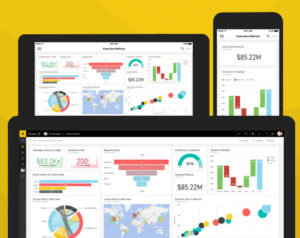
Data visualization is the process of representing information and data in a graphical or visual format such as charts, graphs, dashboards, and maps. It transforms numbers, tables, and raw datasets into visual formats that we all can process easily. Instead of scrolling through endless spreadsheets, a well-designed visualization reveals patterns, relationships, and outliers at a glance.
With tools like Qlik Sense, Looker, and Grafana, businesses and teams can unlock real-time insights and make smarter, faster decisions.
Here’s a definitive guide to the top ten data visualization tools, offering a reality check rather than a tutorial. There are numerous tools available, and most of them excel in a specific area. The trick is knowing what you need before getting lost in the list of features and capabilities.
1. Excel – The First Stop on Everyone’s Journey
Excel is your go-to tool when you need to analyze data in a crude manner. It’s like your dusty hammer, which is a little outdated for sophisticated tasks, but it gets the job done when you simply need to hammer a nail into the wall. In other words, Excel is very basic and does not carry enough weight or power to analyze large datasets in a manner that delivers insights in the easiest and smartest possible way.
If you’re dealing with quick reports, one-off visuals, or no internet access, Excel still delivers. But it’s not made for storytelling or dashboards. It’s clunky when it tries to be modern. And 3D pie charts should honestly be illegal by now.
2. Power BI – Excel’s Smart Sibling That Grew Up in Tech
Power BI is what happens when Microsoft remembers it’s 2025. It looks sleeker, works faster, and communicates with databases without crashing. You get interactivity, real-time data, and dashboards that don’t look like they were designed in 2003.
The problem? It still feels like Microsoft. Sometimes, the interface is over-complicated. Sometimes it’s too rigid. But it’s a strong choice for business use, especially if your team already breathes in SharePoint and Outlook.
3. Google Charts – Light, Free, and Surprisingly Capable
For those who love working in the cloud, Google Charts is a decent tool. It’s not fancy or Instagram-worthy, but it gets the job done. It integrates seamlessly with Google Sheets, works well with web apps, and doesn’t require installation or a budget.
It’s not customizable enough to impress design enthusiasts, and if you want anything beyond bar, line, or pie, you’ll definitely face some stalling. Still, for developers building dashboards into web pages or teams who live in Google Workspace, it’s a great option.
4. Tableau – The One Everyone Talks About for a Reason
People love Tableau and it is for good reason. It’s one of the most well-established and time-tested tools out in the market. It is simple to use in the sense that all you have to do is drag-and-drop everything. With its stunning visuals and filters that actually work, it is a tool par excellence. It turns data into insight faster than most tools known to man. But it’s not cheap. And once you start going deep, you hit a learning curve that isn’t obvious at first. Tableau Public is free, but everything you make is visible to the world. That might work for your blog. It might not work for your board meeting. Either way, if you frequently present data and want it to look professional, Tableau is worth the investment.
5. Zoho Analytics – Quietly Powerful, Overtly Underrated
Zoho Analytics flies under the radar in terms of its capabilities. It does a lot with its dashboards, data blending, sharing, analytics, etc. It connects to major sources and even offers AI-powered insights, which actually aren’t too bad. It’s positioned for business, but not as widely used as Power BI or Tableau, so you may need to train your team on its use. Still, it deserves more attention than it gets. Especially if you already use other Zoho products.
6. Databox – Dashboards on Autopilot
Databox isn’t for analysts. It’s for marketing teams, executives, and people who just want to see key metrics on one screen without ever touching SQL. It pulls in data from dozens of sources, and it’s all plug-and-play. The dashboards look clean, mobile apps are a bonus, and setup is unbelievably fast. But it’s more of a monitoring tool than a true visualization studio. You get KPIs, not creativity. Good for teams. Less good for storytelling.
7. Infogram – Pretty Charts for People with No Time
Infogram is your Instagram for data analysis. Its data visualization capabilities are truly jaw-dropping from the point of view of visuals. It’s made for infographics, social posts, and reports. There are multiple templates for you to choose from and most often you will only have to perform drag and drop actions. It has no code so no headache for those who are not that tech-savvy. The output looks polished, which is great. But it’s not built for deep analysis. It’s for telling a story visually, not exploring data relationships. Still, if you’re in content or communications, it’s a great secret weapon.
8. Datawrapper – The Journalist’s Best Friend
If you’ve read a data story in an online publication, chances are good it used Datawrapper. It’s built to be fast, simple, and web-friendly. You upload a CSV, pick a chart, customize the colors, and embed it. That’s it. It doesn’t overwhelm you with options. It respects white space. And the output always looks clean. For newsrooms, non-profits, and bloggers, it’s one of the easiest ways to turn data into something worth reading.
9. D3.js – The Deep End (Code Heavy)
D3.js isn’t your average chart-making tool. It’s more like a blank canvas with a powerful engine behind it. If you can imagine a data visualization, an interactive timeline, an animated infographic, a real-time updating dashboard, you can probably build it with D3. But there’s no shortcut. You have to know JavaScript, and you’ll likely spend a good amount of time in the documentation or digging through Stack Overflow. This tool isn’t built for beginners, and it’s definitely not ideal if you’re racing toward a deadline. It’s made for developers who want complete creative freedom and aren’t afraid to get into the technicalitites. The results can be stunning, but they take time and effort. Using D3 is like building your own custom car. You get exactly what you want, but you have to construct it piece by piece.
10. Plotly – Code-Friendly but Not Intimidating
Plotly is a bridge. It gives you the interactivity and customization of D3, but without the steep cliff of writing everything from scratch. It works with Python, R, and JavaScript, and produces beautiful interactive charts. If you’re a data scientist or engineer already working in Jupyter notebooks or writing scripts, Plotly feels like home. It’s open-source friendly, and the commercial version is more business-like. It’s a strong contender for anyone who wants interactivity without too much work.
11. Qlik Sense – The Curious Explorer
Qlik Sense is highly detail-oriented in the sense that most tools are comparatively rigid in terms of their features that allow you to explore data in a more openly. This tool enables you to be free in the way you explore data. You can connect the dots you didn’t know existed. You can find information in the corners that you’d never have expected it to exist. However, when it comes to pricing, it is not cheap and its interface is not the latest. But if you think you’re ok with how it looks and would just like to explore, Qlik is your go-to tool.
12. Looker – The Data Perfectionist
Looker is built for perfectionists. This means that you will need to know what you are going to do with the system before you enter data into it. In other words, you will have to know what your data means and how you would like it to turn up. Don’t expect it to be a “drag and drop, and look out for results”. It works for organizations that stick to just a set of data and don’t like conflicting numbers. This tool has a high learning curve. But once you get a hang of it, you’ve got yourself structured information that you can make use of.
13. Grafana – The Real Time Watchdog
Grafana is a tool that you would use if you are into real-time data. This works in any area where there is a requirement for streaming-live data such as IoT, server health, or any kind of system that runs in the background and where the latest information means more than any flashy pie-chart. It’s clean, it’s fast, and it’s open-source. But let’s be real: it’s not here to win design awards. Grafana is here to tell you, right now, if something’s going wrong.
So, Which One Should You Use?
That’s like asking which kitchen knife is best. Depends on what you’re cooking.
- Want speed and familiarity? Excel or Power BI.
- Need interactive dashboards for teams? Tableau or Zoho Analytics.
- Sharing metrics across tools? Databox.
- Building quick, good-looking charts? Infogram or Datawrapper.
- Coding custom visualizations? D3 or Plotly.
- Working in the browser with live data? Google Charts.
Each of these tools is good at something. None of them are good at everything. The trick is knowing what you need before you open the toolbox.
Final Words: Tools Don’t Make the Visual, You Do
Here’s the truth. A beautiful chart that says nothing is still useless. A simple bar graph that reveals a powerful insight? That’s what you need. The tool doesn’t tell the story. You do.
Don’t get caught up in features or obsessed with clarity. Pick a tool that feels right for how your brain works and how your audience thinks. If your visual makes someone say, “Now I see,” then you’ve done your job.
Call-To-Action
Ready to transform your data into powerful insights? At Korcomptenz, we connect you with top-tier talent and solutions tailored to your data visualization needs. Whether you’re seeking expert consultants, developers, or analysts skilled in tools like Tableau, Power BI, or D3.js, we’ve got you covered.
Get in touch with Korcomptenz today and start turning your data into decisions that drive real business impact. Let’s make your data story unforgettable.

FAQ’s About SAP GRC
What’s the best data visualization tool for beginners?
MS Excel is the most easiest tool for beginners. Most already know how to use it, and it lets you create basic charts with minimal fuss. What is data visualization becomes an obvious question at this stage, as tools like Excel introduce the basics through simple graphs and charts. But if you want something more intuitive and modern, Tableau Public is a good leap forward. It’s free, visual, and doesn’t require coding. You won’t build groundbreaking dashboards on day one, but you’ll start thinking in charts instead of rows.
Do I need to know how to code to use these tools?
Not at all. Most tools are drag-and-drop friendly. Tableau, Power BI, and Zoho Analytics don’t expect any programming knowledge. Along the way, you’ll start to understand different types of Data Visualization, like bar charts, heat maps, and scatter plots, and when to use them. But if you do know how to code, tools like D3.js or Plotly will unlock another level of customization and interactivity. The truth is, coding gives you flexibility, but it also makes everything slower. Choose based on what you’re trying to build, not what looks impressive.
What’s the difference between a dashboard and a chart?
A chart answers one question. A dashboard tries to answer several at once. Sometimes too many. Charts are surgical. Dashboards are strategic. The danger with dashboards is overloading them until nothing stands out. Good tools like Power BI, Databox, or Tableau help with layout and filtering, but the thinking still has to come from you.
Which tool should I use if I want to embed visuals on a website?
If your goal is to create visuals that live online, look at Google Charts, Datawrapper, or Infogram. They’re made for web publishing and offer easy embedding. If you’re more technical, Plotly.js and D3.js give you total control, but they’ll also cost you time. Use simple tools unless you need complex interactivity or custom design. For most people, less is more.
Are free tools good enough for professional work?
They can be. Datawrapper, Google Charts, and Tableau Public all have free versions that are more than capable for clean, professional visuals. The limitations usually come in when you need to connect to live data, export in high-res formats, or lock down branding—features often included in full data visualization services. If you’re freelancing, building a portfolio, or experimenting, free tools will do just fine. But for teams and ongoing reporting, the paid tiers are worth it.
Share this article
Facebook
LinkedIn
Twitter
Use AI to summarize this article